Climate Science Glossary from CPDN, University of Oxford

Climate Science Glossary
In this Climate Science Glossary, we have collected together some of the more technical climate science terms used in this website and given them a short description.
Atmosphere-Ocean Interaction
The oceans and atmosphere interact in many different ways. There can be a net exchange of heat, salt, water and momentum between them.
When wind blows over the ocean, energy is transferred from the wind (slowing it down) to the surface layers, some of which then drives ocean currents. Water can evaporate more easily into warm air, especially if it is windy. As it evaporates, it removes heat from the ocean. If it then condenses to form a cloud droplet, it releases the heat into the air. This is one of the main ways they get their energy.
Salt is continuously brought into the oceans by the rivers draining off the continents, which carry minerals dissolved from the rocks they run over, and deposited as sediment on the ocean floor. Water evaporating or freezing at the oceans’ surface leaves the remaining water saltier, but rain, which is not salty, dilutes the salt concentration of the surface ocean. In addition, when it’s really windy, salty droplets of ocean water can be blown into the air, and these can form the basis of cloud droplets.
The air and the ocean are continuously exchanging heat. As the ocean has a higher heat capacity, it takes longer to adjust to changes in incoming radiation, and therefore tends to change temperature slower. This means that the surface of the sea is usually a different temperature to the air immediately above it, and heat is transferred between the ocean and the atmosphere.
There are many feedback mechanisms between the oceans and the atmospheres. For example, evaporating water can condense in the atmosphere to form clouds. These reflect both incoming and outgoing radiation (which is why cloudy nights feel warmer than clear ones) and so determine the temperature of the ocean surface.
Carbon Dioxide and Climate Change
The climate of the Earth is constantly changing, in response to changes in the incoming solar radiation, the patterns of the continents, the amount of dust in the atmosphere, the chemical composition of the atmosphere and many other factors.
One of the factors which is thought to affect surface temperatures is the atmospheric concentration of carbon dioxide. Carbon dioxide is a ‘greenhouse gas’. This means that it does not reflect much incoming solar radiation, but it does strongly absorb outgoing, long wave, thermal radiation, re-emitting it back towards the surface and warming the atmosphere.
Atmospheric concentrations of carbon dioxide have been increasing in the past 200 years or so since the Industrial Revolution began. The source is mainly the burning of fossil fuels (coal, oil and gas) – for transport, industry, electricity or heat. The rest is due to land use change, such as deforestation.
Scientists are still uncertain exactly how the Earth-climate system will respond to such changes in carbon dioxide and other changes to the composition of the atmosphere.
Circulation Systems
The most important origin of atmospheric circulation is the difference in incoming solar radiation from equator to pole, leading to energy differences on the earth’s surface. This difference, caused by the spherical shape of the earth, generates different temperatures and therefore varying atmospheric pressure, the compensation for which induces wind systems. The same is true for the oceans and their circulation systems.
Other important determinants of atmospheric circulation are the rotation of the earth, the height of the earth’s surface (orography), and the location of continents and oceans and the so called latent heat. Approximately one fourth of the incoming solar energy is used to evaporate water from the earth’s surface. This energy is saved as latent heat which is released again when the vapour condenses and it starts to rain.
The earth’s rotation alters the circulation from the solar radiation-induced north-south pattern (hot equator, cold poles) to a more east-west directed circulation. The earth’s topography causes very large systems of low and high pressure. Thus changes in the structure of the surface cause changes in the dynamics of the climate system. These changes are especially substantial if they involve positive feedback mechanisms which amplify the effects of changes. A well-known example of positive feedback is connected to the melting of ice sheets. A warming of the polar regions induces their melting. With this the colour of the surface in this region changes from white to the colour of dark soil or water, which absorbs a larger fraction of the incoming sunlight and therefore exacerbates the warming of the region, which in turn increases the speed of the melting.
Besides this so-called ice-albedo effect, many other feedback mechanisms belong to the climate system, positive as well as negative. Another important positive mechanisms is the increasing ability of a warming lower atmosphere to contain water vapour which functions as a greenhouse gas.
So far the climate system is described as the more or less balanced interaction of the earth system’s spheres. The balance depends on the steady continuity of external and internal forcings, where the latter are especially positive and negative feedback mechanisms.
It is important to state that the energy balance (thermodynamics) and circulation systems (dynamics) are not equally fundamental. A climate system without any dynamics is still a climate system, whereas the dynamics only emerge on a thermodynamic basis. This is very important for climate modelling.
Climate Attribution Studies
Return Time Plots with Two Sets of Data
If two return time plots are shown on the same graph it is very easy to compare how the likelihood of a certain extreme event is different in each plot.
In our climate attribution studies, where we are trying to find out if climate change has changed the risk of extreme weather events occurring, we plot the results from two model ensembles, each made up of tens of thousands of model simulations.
One ensemble represents the world as it actually is, including the effects of man-made climate change. The other ensemble represents the climate “that might have been”, without man-made climate change.
Since each plot shows the chance of an extreme weather event occurring in a different “world”, the difference between the two curves tells us how the probability of the extreme weather event has changed due to the human influence on the climate.
This allows us to answer the crucial question: “has the likelihood of a particular weather event occurring changed due to climate change?”
Weather@Home Climate Attribution Experiments
When you look at the return time plot for any of our climate attribution studies, such as the Weather@Home 2014 UK Flooding experiment, the results are presented as a return time plot with two curves – blue and green, plus some light green dots:

All the dots of the same dark colour (blue or green) belong to an ensemble of climate models with identical climate conditions. In this example, dark blue is the winter as observed; dark green is the “world that might have been” without man-made climate change.
The only difference between these two ensembles is the human influence on the climate system. The “world that might have been” models are carefully designed to remove the human drivers of climate change, such as greenhouse gas emissions.
Since we have no observations of the hypothetical “world that might have been”, the uncertainty is higher than for the world that was actually observed. To account for this uncertainty we do not just make one ensemble with the human signal removed from the climate drivers, but several ensembles with different possible ways of removing that signal. These are represented by the light green dots. The light green dots, therefore, represent our understanding of the uncertainty in the “world that might have been” model.
How can we tell if climate change has influenced the chance of extreme weather occurring?
If, when you compare the results from the two types of simulations in this return time plot, you see that the blue curve (observed winter) is lying above the green curve (“world that might have been”, without climate change) then you can say that the in the observed winter, a threshold for extreme rainfall is exceeded more frequently than in the “world that might have been, without climate change”.
That is, climate change slightly increased the probability of extreme rainfall occurring that winter.
If the blue curve is below the green, then the probability of the rainfall threshold being exceeded has been made less likely due to climate change.
In our Weather@Home 2014 UK Flooding experiment, we found that the blue “observed winter” curve did indeed lie above the green “world that might have been” curve. More specifically, we found that a 1-in-100-year winter rainfall event (ie. 1% risk of extreme rainfall in the winter of any given year) is now estimated to be a 1-in-80 year event (i.e. 1.25% risk of extreme rainfall in any given winter) so the risk of a very wet winter has increased by around 25%. This change is statistically significant thanks to the number of computer simulations we were able to run– over 33,000 computer models run in the experiment.
Diurnal Temperature Cycle
The Earth has a daily pattern of heating and cooling. The hottest part of the land surface moves west during the day. You can also see that the ocean surface temperature doesn’t vary anywhere near as much during the day as the land (especially in the centre of a large continent, such as Africa), as it takes longer to heat up/cool down.
Energy Balance
The incoming solar radiation is normally given as an amount of energy per square meter per second averaged over the entire earth. But due to the different distances between the sun and points on the earth’s surface, the forcing is not at all homogeneous around the globe. Approximately 30% of this energy is reflected back to space by clouds, aerosols and the surface of the earth.
Due to the reflecting properties of aerosols natural events like volcanic eruptions or aerosol-containing industrial emissions may induce considerable changes to the earth’s energy balance. The remaining two thirds of this energy is absorbed by the earth and, to achieve a balance, emitted back as longwave radiation. If this longwave radiation was directly emitted to space the average surface temperature of the earth would -19C which is 34C less than it actually is. However, only ten per cent of the outgoing surface radiation goes directly into space. This is due to greenhouse gases and some types of clouds that absorb a small part of the surface radiation and reflect more than 80% back to earth. It is the same effect that the glass roof of a greenhouse produces. The most important greenhouse gases are water vapour, existing only for days, and carbon dioxide, which can survive for millenia.
Feedbacks
Feedbacks are processes in which outputs from the process have an effect on the inputs to that same process. Sometimes feedback processes act to offset or inhibit a change (negative feedback), and sometimes they act to amplify a change (positive feedback). Examples of negative feedback include the maintenance of your body temperature: when you get too warm, you trigger various mechanisms (e.g. perspiration) to cool you down and vice versa. A common example of positive feedback is often associated with amplified music or speech, when the microphone is placed too close to a loudspeaker… someone speaks/ sings/ plays into the microphone, the noise is amplified, and comes out of the speaker. If some of this amplified noise goes back into the microphone, it gets amplified again etc. etc. and the end result is a deafening whine.
There are many examples of feedbacks in the climate system. If the atmosphere gets warmer, ice melts. Ice reflects a lot of incoming solar radiation, so if it melts, less gets reflected, more gets absorbed by the Earth and the atmosphere gets warmer; a positive feedback. On the other hand, if there is more carbon dioxide in the atmosphere, some plants grow faster, absorbing more carbon dioxide and eventually reducing its amount in the atmosphere; a negative feedback.
Because of the complexity of the climate system, due to the presence of feedbacks within it, we need to try to represent the whole system as thoroughly as possible in order to simulate the likely changes. We need to be able to understand how and where feedbacks act, and how large they are.
Global Atmospheric Circulation
The circulation of the atmosphere is responsible for about 50% of the transport of energy from the tropics to the poles. The basic mechanism is very simple: hot air rises in the tropics, reducing the pressure at the surface and increasing it higher up. This forces the air to spread away polewards at high levels, and to be drawn in at low levels. As the warm, polewards moving air comes into regions with less incoming solar radiation, it cools and sinks, thus completing the circulation.
2.jpg)
If the Earth were not rotating, we would see this very simple pattern: hot air would rise in the tropics, move away from the equator, gradually cool, sink at high latitudes near the poles, and finally re-circulate near the surface towards the equator.
However, the Earth’s rotation complicates things. For a given point on the Earth’s surface to do a full rotation, it has to travel a lot further at the equator (2 π times the radius of the Earth; i.e. 6,371 km), than at mid-latitudes, and at the poles it doesn’t have to travel at all, just rotate. Speed is defined as a distance divided by time, so for a full rotation in 24 hours, this means that the speed of the surface of the Earth is greatest at the equator, and falls with increasing latitude.
Now, imagine a cannonball fired towards North from the Equator. In addition to its northward speed, the cannonball also has the same easterly speed as the Earth from which it was launched. But, as it travels further North, the Earth underneath it is moving slower than the Earth at the equator was. So the cannonball appears to drift to the east in flight. This is called the Coriolis effect or force. The Coriolis force is the reason why the upper level, polewards travelling air (wind!) is westerly (west to east); whereas the equatorwards travelling, surface winds are easterly (east to west). In the tropics, these easterlies are known as the trade winds.
In the case of the atmosphere, this means that winds travelling polewards get a bigger and bigger westerly speed. This peaks in the sub-tropical jet streams where air speeds are typically 40m/s in the upper troposphere. With such large vertical velocity gradients, the air becomes unstable, and waves develop in the westerly flow. We experience these as the low pressure systems which regularly pass over the North of Europe. These systems mix the air, which results in the transport of cold air equatorwards and of warm air polewards. Their net effect is the transport of heat polewards and they set up the so-called Ferrell cell, which rotates in the opposite sense to the Hadley Cell.
In the Polar regions, the circulation pattern is very similar to the Hadley Cell and is called the Polar Cell. It is driven by the ascent of warmer air and the descent of colder air. The mid-latitude jet stream is found in the upper troposphere where the Ferrell and Polar cells meet.
Greenhouse Effect
In the nineteenth century various scientists (such as Joseph Fourier) explained that the atmosphere can, like an ordinary greenhouse, retain energy radiated into it from outside. The greenhouse analogy isn’t very exact, but the name certainly stuck.
In the 1860s John Tyndall explained that certain gases, including water vapour and carbon dioxide (CO2), don’t affect visible light but absorb longer wavelength radiation (infrared, heat). He suggested that these gases insulate the Earth.
The actual process works like this: visible incoming sunlight either gets reflected (for example by clouds, or aeroplanes), or passes unhindered through the atmosphere, and gets absorbed by the surface of the Earth, thus heating it. The Earth radiates heat from the surface back into the atmosphere, where it can pass back into space, or get reflected again, or, because it has now got a longer wavelength than before, it can get absorbed by the water vapour, carbon dioxide, methane and other greenhouse gases which are present in the atmosphere. As the water vapour/ methane/ carbon dioxide molecules absorb the longwave radiation, they heat up, and in turn re-radiate long wave radiation in all directions. Some is lost to space, but some of it also gets radiated back to the surface, again warming it.

This diagram shows how the greenhouse effect works, from Wikimedia Commons.
This naturally occurring process helps keep the Earth warm enough for liquid water to exist. Without greenhouse gases, the average temperature at the Earth’s surface would reach only -17ºC, approximately 33ºC colder than it actually is!
Now, what if the concentrations of these insulating gases increase? We might expect the process described above to intensify. In fact, this is just what the Nobel Prize-winning Swedish chemist Svante Arrhenius did in 1896. By knowing how CO2 absorbs heat radiation from the surface of the Earth, he calculated what would happen if the amount of CO2 in the atmosphere were doubled. He estimated that a doubling of CO2 would lead to an average global surface temperature increase of 2 °C. This is consistent with modern predictions.
This approach, while still a handy first guess, considers the climate system in the absence of any feedback processes.
Horizontal resolution (Grids)
Global Climate Models (GCMs) work by calculating what the climate is doing (in terms of wind, temperature, humidity, etc.) at a number of discrete points on the Earth’s surface and in the atmosphere/ocean. These points are laid out as a grid covering the surface of the Earth, dividing it up into a lot of little boxes. The more boxes there are, the finer the resolution of the model and the smaller-scale climate features it can represent. From this point of view, the best climate model would be the one with the finest resolution.
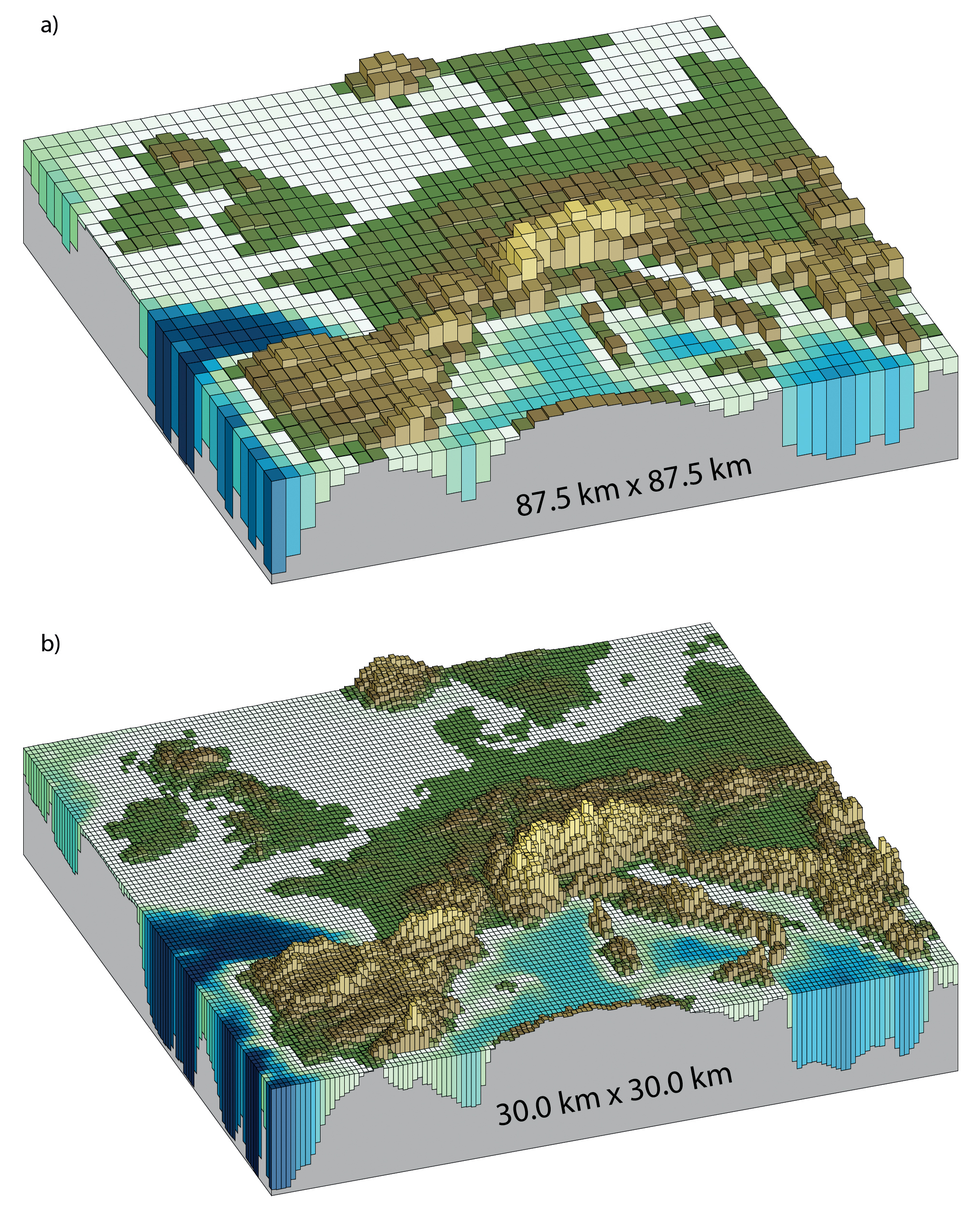
Horizontal resolutions considered in today’s higher resolution models and in the very high resolution models now being tested: (a) Illustration of the European
topography at a resolution of 87.5 × 87.5 km; (b) same as (a) but for a resolution of 30.0 × 30.0 km. Source: IPCC
Unfortunately this has disadvantages; the more points there are, the more calculations need to be made, and so the more computer time the model takes to run. In general, we have to make a compromise between resolution and time to run a model.
This is why, in the CPDN (climateprediction.net) global model, there are only 4 grid boxes over the British Isles. This is obviously not going to do very well at representing the climate in, for example, the Lake District, which is a mountainous region which covers an area much smaller than one grid box. It should, however, be good enough to get an accurate picture of the large scale climate of, for example, the British Isles. The resolution is 2.5° in latitude by 3.75° in longitude.
Mid-latitudes
The mid-latitudes (roughly 30°-60°) are dominated by the weather systems that form when the Hadley Cell becomes unstable and breaks down into a series of alternating low and high pressure systems. The regions where these systems are concentrated are known as storm tracks. In the Southern Hemisphere, where there is little land, the storm track is fairly continuous around the Earth. However, in the Northern Hemisphere, storm tracks are only seen over the oceans. This is because friction is much greater over the uneven surface of the land, and slows down any winds blowing over it.
The climate in mid-latitudes is highly seasonal, being warmest when the Sun is highest in the sky at the summer solstice. It is also governed by patterns in land and sea. Britain is warmer than most places at a comparable latitude thanks to the energy transported polewards by the North Atlantic current and the westerly winds. It also has a much smaller seasonal cycle than, say, Siberia, because it is surrounded by water which reacts slowly to changes in the incoming solar radiation.
Ocean Models
The ocean, like the atmosphere, is a fluid component of the climate system and must be represented in climate models. Heat and water are passed between the ocean and atmosphere, and these processes must be represented as accurately as possible. Also, the wind speed at the surface affects the way that the top of the ocean is mixed and so how rapidly it responds to changing atmospheric temperatures.
Ocean “weather systems” or eddies, which play an important role in the climate system, tend to be much smaller (up to about 100km) than atmospheric weather systems, so the ocean components of climate models tend to have a finer resolution than the atmosphere components. Oceans take much longer to react to changes in the balance between incoming and outgoing radiation than the atmosphere. This means that ocean models need to run for many decades if they are to be included in climate predictions. These factors mean that they require significantly more computing power than atmosphere models. This is sometimes avoided by using a simplified model called a “slab ocean”, which effectively just represents the top 50m of the ocean, with none of the deep sea currents which can transport a huge amount of heat, albeit extremely slowly. The effects of the currents therefore need to be parameterized.
Both a slab ocean model and a ‘complete’ ocean model will be ‘coupled’ to the atmosphere model in the CPDN experiment. The complete ocean model used by the CPDN experiment in fact has the same horizontal resolution (2.5° in latitude by 3.75° in longitude) as the atmosphere, and 20 vertical levels, with finer vertical resolution near the surface.
The coupled model runs asynchronously, which means that the atmosphere model runs first for some time then the ocean model runs for some time, taking turns. In the case of the model used in the CPDN experiment, the individual components run for one day at a time.
Fluxes of heat, wind, and freshwater are passed between the ocean model and the atmosphere model at the ocean-atmosphere interface.
Oceanic Circulation
The circulation of the oceans is responsible for about 50% of the transport of energy from the tropics to the poles. As in the atmosphere, the circulation is driven by the heating of surface waters in the tropics, and cooling at the poles. Cold surface currents travel equatorwards and warm surface currents travel polewards.
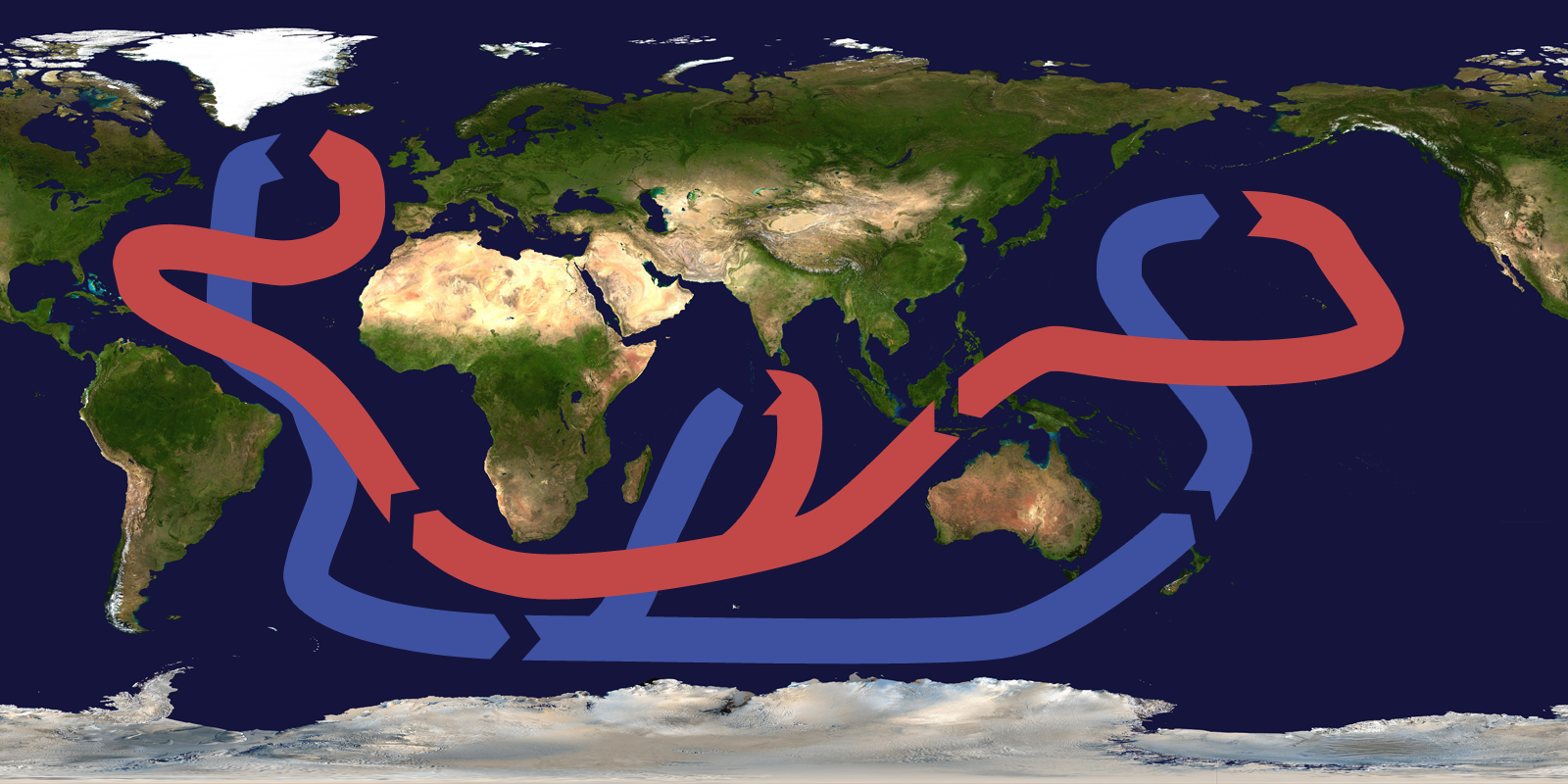
Map of the world showing the global thermohaline circulation, from Wikimedia Commons.
The full, large scale circulation pattern of the ocean is called the thermohaline circulation because it is driven by differences both in temperature and salt concentrations. When water evaporates or freezes, it leaves behind its salt, making the remaining water more saline and therefore more dense. The North Atlantic Deep Water, for example, is formed by water in the Greenland Sea, which is both very cold and very salty, and therefore sinks and spreads equatorwards.
This all means that the three-dimensional structure of the ocean is very complicated, and, as yet, relatively little is known about it.
The ocean has a greater capacity for storing heat than the atmosphere, which means it reacts slower than the atmosphere to changes in the balance in incoming/ outgoing radiation. This means that ocean temperatures change more slowly than atmospheric ones, whether this is on a diurnal, seasonal or climate time scale.
Parameterizations
The problem with dividing the atmosphere into lots of little cubes is that there are many processes that are smaller than the cubes. So, for example, individual clouds may well be smaller than a grid box. They do still play an important role in the climate system, especially collectively, so somehow the processes that form them and the consequences of them existing must be represented.
So, for example, based on knowledge of the temperature and humidity in a box, we must estimate how much cloud and how much rain there is in the box. We also need to know how much dust (i.e. ‘aerosol’) is in the box, as raindrops require a very small solid particle in the air to form on. This process is called parameterizing.
There are many parameterization schemes in the model, such as the scheme which calculates how much cloud there is. Some of these schemes are believed to be quite reliable, but others are far less well understood and we’re not very sure about them.
Return Time Plots
What are Return Time Plots?
Return time plots are a way of graphically representing the most extreme events in a big sample of data, such as weather data or river flows. These types of plot are a convenient way to look closely at the “tail” of a distribution, which is hard to see in detail when you plot the data in a more familiar way, such as in a histogram, where your attention is drawn to the middle of the distribution.
The “return time” of an event, also known as the “return period” or “recurrence interval”, is the likelihood of an event occurring, defined by a particular variable exceeding a certain threshold in a certain time interval. For example, you would say an extreme flood had occurred if rainfall exceeded 350mm during the winter season.
What does each dot represent?
Final results from the Weather@Home 2014: UK Flooding Experiment,
showing nearly 40,000 models results: each dot represents one model
In Weather@Home experiments, each dot on the plot represents a single model simulation which has been run on a participant’s computer. We run tens of thousands of model simulations, which are identical to each other except for their starting conditions, which are varied slightly. These slight differences result in a different outcome in each model for the risk of certain events.
Our Weather@Home experiments are designed to answer the question: did climate change have an effect on the likelihood of this extreme weather event occurring? They involve comparing two sets of models – one with climate change and one in a “world that might have been” without climate change, which is why there are two colours of dots on these graphs, representing these two sets of models.
When these model simulations are put together to form large ensembles, we can look at the average risk for that particular event. We plot all the individual models on one graph and you can see the curve that emerges, which represents the range of results from the entire ensemble:
If you look at a plot of just a small number of model simulations, and compare it to a plot with tens of thousands, you can see why it’s so important to run these large ensembles of models if you want to get clear, statistically significant results:

Comparison of results from the Weather@Home 2014: UK Flooding Experiment
with just a few models (left) and tens of thousands of models (right)
What does the x-axis along the bottom mean?
The x-axis tells us the chance of an event occurring in a given year, such a seasonal rainfall, exceeding a particular threshold. With extreme weather events, we tend to talk about “1 in 10 year events”, which occur quite frequently. The chance of such an event occurring is 1 in 10, or 10%, in any given year.
The further you go to the right of the plot, the rarer the events get, all the way up to “1 in 1000 year events”, which are very rare, having a 0.1% chance of occurring in a given year.
The phrase “1 in 100 year event” does not mean that an event will occur exactly every 100 years, but that the probability is that it will occur once every 100 years.
The x-axis is logarithmic, which means that each number is 10 times bigger than the last (for example 10, 100, 1000), rather than there being the same distance between each (for example 10, 20, 30). This logarithmic scale lets us show a wide range of values more clearly in a single plot.
What does the y-axis up the side mean?
The y-axis shows the magnitude of the weather event in the form of a threshold. In this example, looking at high rainfall, the y-axis shows the total rainfall during a particular season that exceeded a threshold.
A low rainfall value, such as a winter with only 100mm or more of rain, would be a normal winter in the UK, which does not lead to widespread flooding.
A rainy season, which exceeded 350mm of rain, would be a “1 in 100 year event” and will have led to extreme flooding.
Why are some graphs the other way up?
When you are looking at the risk of flooding, you are interested in whether rainfall is more than a certain threshold. It’s very likely to exceed a low threshold but increasingly unlikely to exceed a high threshold. This explains why the curve on return time plots for flood risk increase from left to right – more than 100mm of rain falls almost every year (1/1) but more than 350mm of rain only happens 1/1000 years or less.
For drought risk, on the other hand, you are interested in how low the rainfall is. So, it’s very likely that you will get less than a large amount of rain – less than 800mm of rain will occur almost every year – but it’s very unlikely that you will get less than 100mm of rain – this might occur only once every 100 years (1/100):

How can we use Return Time Plots to understand the influence of climate change?
Seasonal Temperature Cycle
The seasonal cycle in the atmosphere is driven by the fact that the Earth’s axis is not at right angles to the sun (it is actually 23° away from perpendicular). This means that, at different times of year, different latitudes get the most incoming solar radiation. At the equinoxes, the sun is overhead at the equator, at the June solstice, the sun is over the Tropic of Cancer and at the December solstice, it is over the Tropic of Capricorn. This means that, in June, July and August (northern hemisphere summer), the northern hemisphere is warmer than the southern hemisphere. Similarly in December, January and February, the southern hemisphere is warmer. These months are not symmetrical about the solstice (for example, we do not talk about the November, December, January season) because the climate system tends to lag the sun, as it takes a while to heat up or cool down.
The Unified Model
The atmospheric part of the model used by CPDN is the UK Met Office’s state-of-the-art Unified Model; the same model that is used to produce every weather forecast you see on British terrestrial television. There are, of course, some differences between the way in which the model is run to produce a commercial weather forecast and how we are running it, the most obvious being the resolution.
For more detailed, technical information about the Unified Model, visit the Met Office web site.
Thermohaline Circulation / AMOC (Atlantic Meridional Overturning Circulation)
In the Atlantic Ocean, there is a net flow of water northwards in the surface layers in the Gulf Stream and its extension, the North Atlantic Current. This brings warm, salty water from the tropics to the high northern latitudes. At high latitudes, the ocean releases heat to the atmosphere, making the surface waters cooler, and sea ice is formed, making the surface waters saltier. Both the temperature decrease and the salinity increase make the water denser. This allows the surface waters to sink and return southwards in the deep ocean. This deep water finally returns to the surface, closing the circulation loop; it is thought that one way this happens is through upwelling in the Southern Ocean around Antarctica. The AMOC transports around 20 million cubic metres of water per second, and it transports around 1PW of heat northwards in the Atlantic basin, contributing to the mild climate of Western Europe.
What would happen if the AMOC collapsed?
Model studies suggest that a collapse of the AMOC could lead to a reduction in surface air temperature of around 1 to 3°C in the North Atlantic region and surrounding land masses, but with local cooling of up to 8°C in areas of increased sea ice. A smaller cooling effect would be expected throughout the northern hemisphere, with a slight warming in the southern hemisphere after a few decades. Several studies suggest that there would be a change in precipitation patterns over the tropics, associated with a southward shift of the inter-tropical convergence zone, which could also affect the intensity of the El Nino Southern Oscillation (ENSO) in the Pacific. A collapse of the AMOC might also lead to an intensification of the North Atlantic storm track, with stronger winds over Europe. Over a period of years to decades, there would be regional changes in sea level, with a sea level rise in the North Atlantic of up to 80cm. Studies also suggest there could be impacts on the carbon cycle and on soil moisture and primary productivity of the terrestrial vegetation.
Time Steps
As well as dividing the atmosphere up into boxes, time also progresses in finite intervals. In the CPDN model, the basic time step is half an hour. The model starts from a set of initial conditions for the atmosphere and ocean and then calculates what they will have evolved to after half an hour, 1 hour etc.
Choosing the time step is not easy. If you want to run a model through 50 years as quickly as possible, you want to use as large a time step as possible. Unfortunately, this isn’t possible because, with a time step over some critical level, the model becomes unstable and stops working. In very simplified terms, you can think of this as happening when the time step is so large, that air (or, more accurately, energy) can travel further than one grid box in one time step, and it becomes impossible to accurately determine how the fields develop.
However, some things in the atmosphere change more rapidly than others, and so need to be calculated more frequently. So, for example, the dynamics (essentially the movement of the air) needs to be calculated every half hour, but the radiation (the balance of incoming and outgoing energy) can be calculated less frequently. This is why, if you watch the model running, it seems to complete some time steps much more quickly than others.
In the ocean, the ratio of the horizontal grid size to the length of a time step must not exceed the largest flow speed of water in the ocean.
Tropics
The Tropics, defined as the region between the tropics of Cancer and Capricorn, have a climate dominated by the large scale convection associated with the Inter-Tropical Convergence Zone (the ITCZ). This moves with the seasons, according to which latitude is closest to the sun. At the equinoxes, the sun is closest to the equator, at the December solstice, the sun is over the Tropic of Capricorn and at the June solstice, it is over the Tropic of Cancer. The most rapid ascent of hot air, associated with the formation of towering cumulonimbus clouds, is found at the ITCZ. These are often the source of the heavy rains and violent thunderstorms of the tropics.

Intertropical Convergence Zone. Source: Wikimedia Commons
Tropical climates are normally hot and humid and usually show far less seasonality in temperature than extra-tropical climates. On the other hand, other climate features, such as rainfall and wind patterns, can show pronounced regularity, such as the monsoons.
The most dramatic weather systems found in the tropics are tropical cyclones: called hurricanes in the Atlantic, Caribbean and eastern Pacific, cyclones in the Indian Ocean and typhoons in the western North Pacific. They are low pressure systems, typically 200 to 2,000 km across, with wind speeds greater than 120 km/hour. They consist of deep cumulonimbus clouds, up to 12 km high, spiralling around a central, clear eye where air is descending. They form over warm tropical oceans, but cannot form equatorwards of 5°, as the Coriolis force is too weak. They rapidly decay when they move over land and are cut off from their source of warm water.
The model we are using isn’t great at producing hurricanes, mostly because the grid is too coarse for the relevant processes to operate.
The monsoon is another important feature of the tropical climate, and is a result of land/sea differences and the seasons. Continental land masses cool down and heat up faster than oceans because their thermal heat capacity is lower. This means that, in winter, the air above the continents is colder than the air above the oceans. The same processes which cause the large scale atmospheric circulation then operate, and there is ascent over the oceans, descent over the continents and surface level flow from the continents to the oceans. In the summer the reverse happens. The seasonal reversing winds are called the monsoon (derived from the Arabic word for season, mausim), and most affect the Indian Ocean and western tropical Pacific. The monsoon pattern interacts with the large scale atmospheric circulation and is affected by the orography (the shape of the land surface, for example the Himalayas), which together produces a complicated weather pattern in south-west Asia.
Vertical Resolutions (Levels)
In a similar way to the horizontal grid, the vertical profile of the atmosphere is divided into a number of different levels. The model used in CPDN has 19 vertical levels in the atmosphere (and 20 in the ocean). Unlike the horizontal grid, the vertical grid is not evenly spaced. They’re not even equally spaced in pressure, which could make sense as, for example, the 950 hPa (near the surface) and 900hPa levels (a bit further up) have the same mass of air between them as the 100hPa and 50hPa levels, even though the physical distance between them is much less. This is because the density of air decreases exponentially with distance from the Earth’s surface: the difference in pressure between the top of Everest (about 10km up) and about 9km up is much smaller than the difference in pressure between sea level and 1km up.
The levels are unevenly spaced in terms of pressure so that they can be concentrated in the areas, i.e. near the surface, where we are more interested in knowing what is going on than at other levels. The model levels take into account what the surface is doing; so a level doesn’t suddenly vanish as it intersects a mountain! The top level is at about 30km; in the middle of the stratosphere.
Volcanic Emissions
Emissions from volcanic eruptions are an example of a forcing on the climate system.
Do all volcanic eruptions have an effect on the climate system?
Only volcanic eruptions large enough to force dust up into the relatively stable stratosphere have a significant effect on the world’s climate. Pinatubo, which erupted in 1992, cooled the Earth noticeably for about 2 years.
Is there any uncertainty surrounding past observations of volcanic emissions?
There is a reasonable amount of uncertainty in observations of volcanic emissions in the past – particularly in the pre-satellite era.
How have volcanic emissions been included in CPDN?
For the past 80 years, we have created 5 data sets based on the Sato and Amman observations of volcanic aerosol in the stratosphere. This data is divided into 4 latitude bands of equal area – 90ºS-30ºS, 30ºS to the equator, the equator to 30ºN, 30ºN to 90ºN.
For the future, we have created 10 possible scenarios, as we have, of course, no idea what volcanoes may erupt where. One scenario simply repeats the recent past according to the Sato (2002) data set. Two more are based on observations of the preceding 80 years, based on the Sato and Amman data sets. The remaining 7 are subsets of observations of 1400-1960, based on a data set constructed by Crowley.